PEPSI x THAIA FLAVOR THAT FLOWS THROUGH THAILAND
Pepsi has always been part of everyday life in Thailand — from street food stalls to road trips, local festivals to football matches. It's more than just a drink; it’s a companion in the moments that matter.
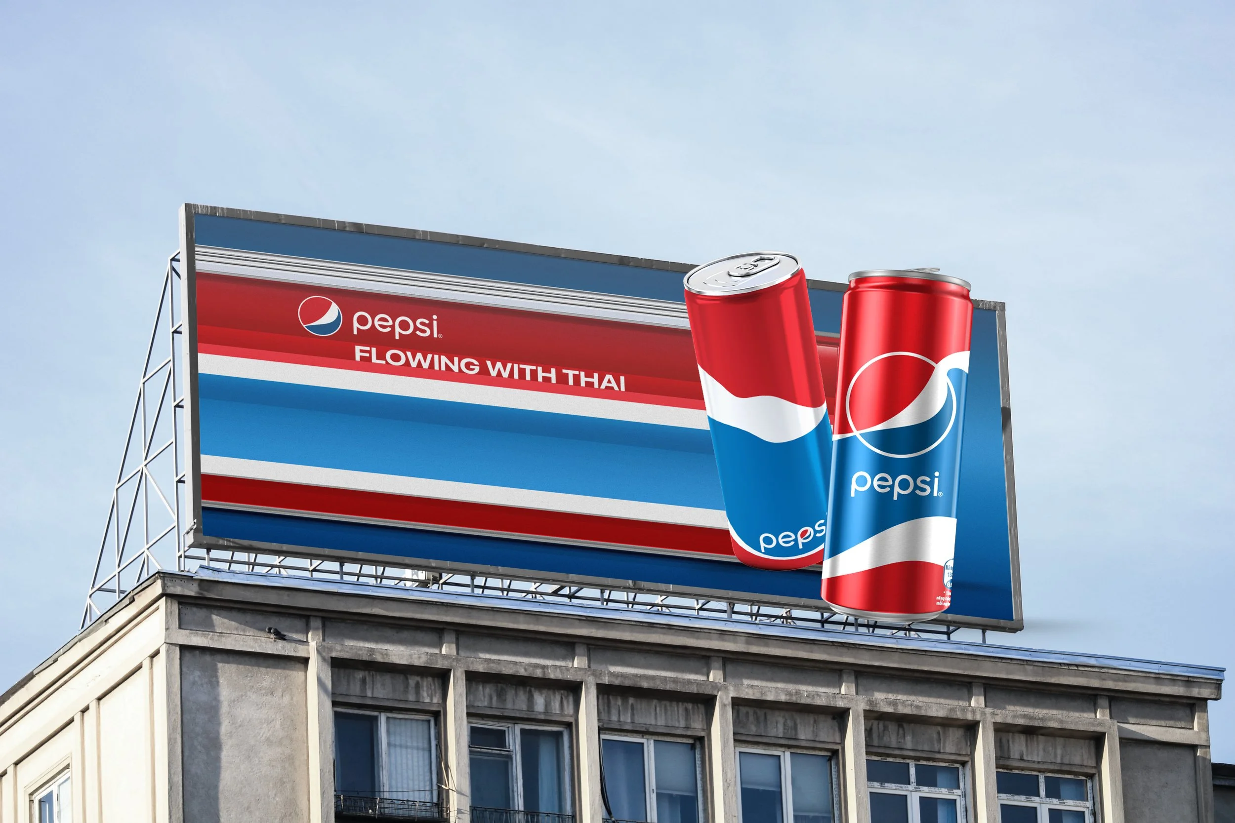
To celebrate this connection, Pepsi is launching a limited-edition can series inspired by the vibrant spirit of Thailand. Featuring bold designs infused with the colors of the Thai flag, each can pays tribute to the nation's rich culture, energy, and joyful way of life — honoring a country that lives boldly, laughs loudly, and embraces every moment.
Sector : Beverages
Scope: Design Strategy, Creative Direction, Campaign, Print , Online

Design Research to
Design Strategy
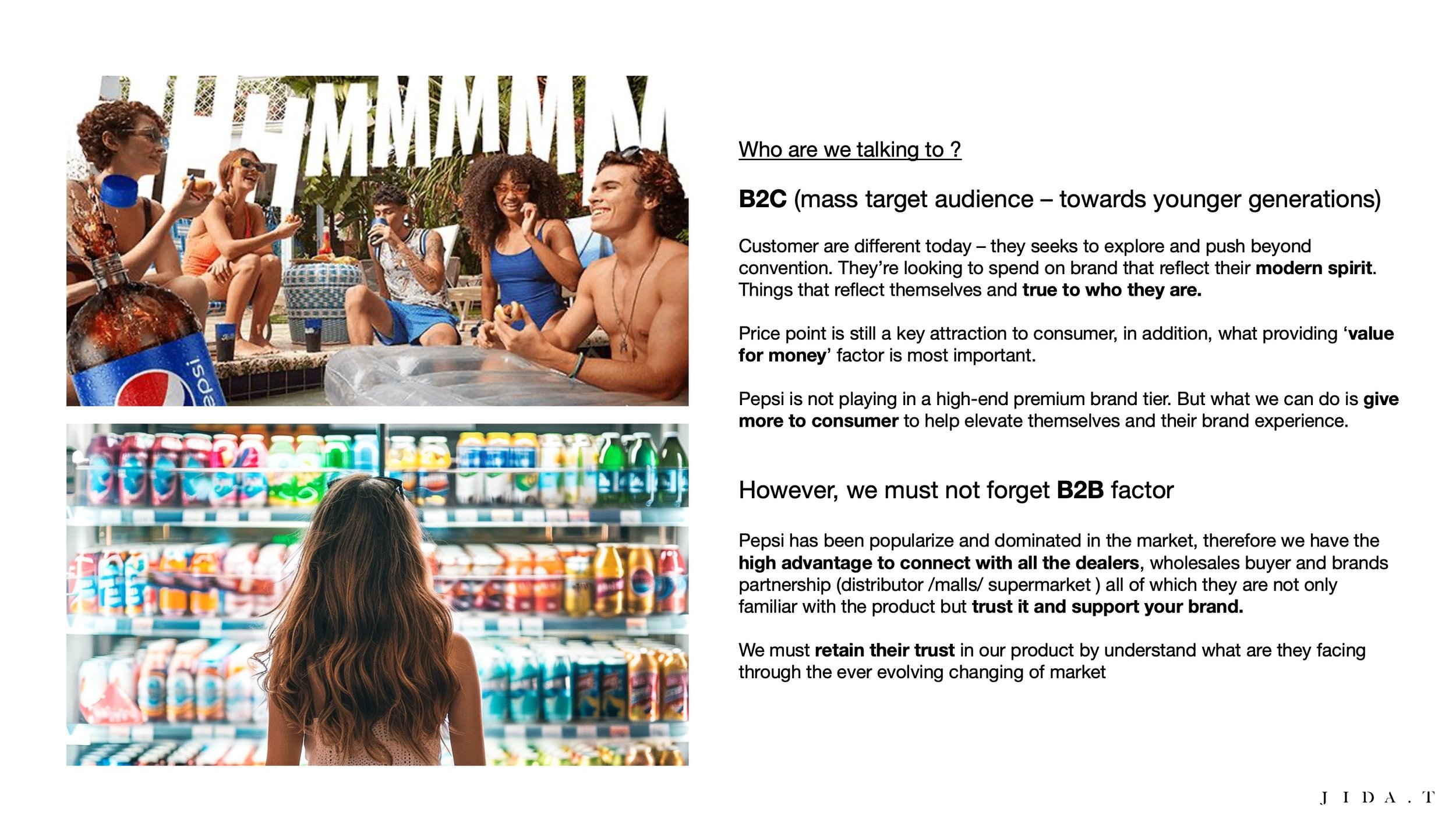
Conduct design research to identify market opportunities and strategic approaches. Focus on young audience preferences and trend alignment to ensure relevance and establish competitive positioning in the LTO market.


Pepsi X Thai LTO
Cultural Truth: Pepsi has been part of Thailand's daily life for generations, becoming deeply embedded in our national culture.
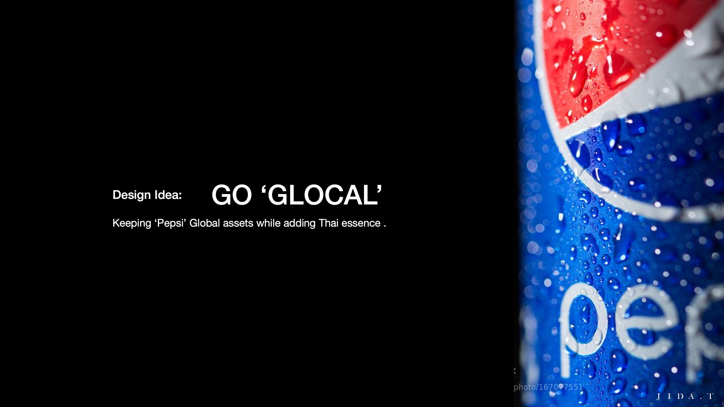
Design Strategy: Seamlessly integrated Thailand's national identity—the Thai flag—into Pepsi's iconic can design, creating a powerful symbol of cultural connection.
Brand Message: "A Flavor that Flows Through Thailand "—celebrating how Pepsi has become woven into the fabric of Thai life.
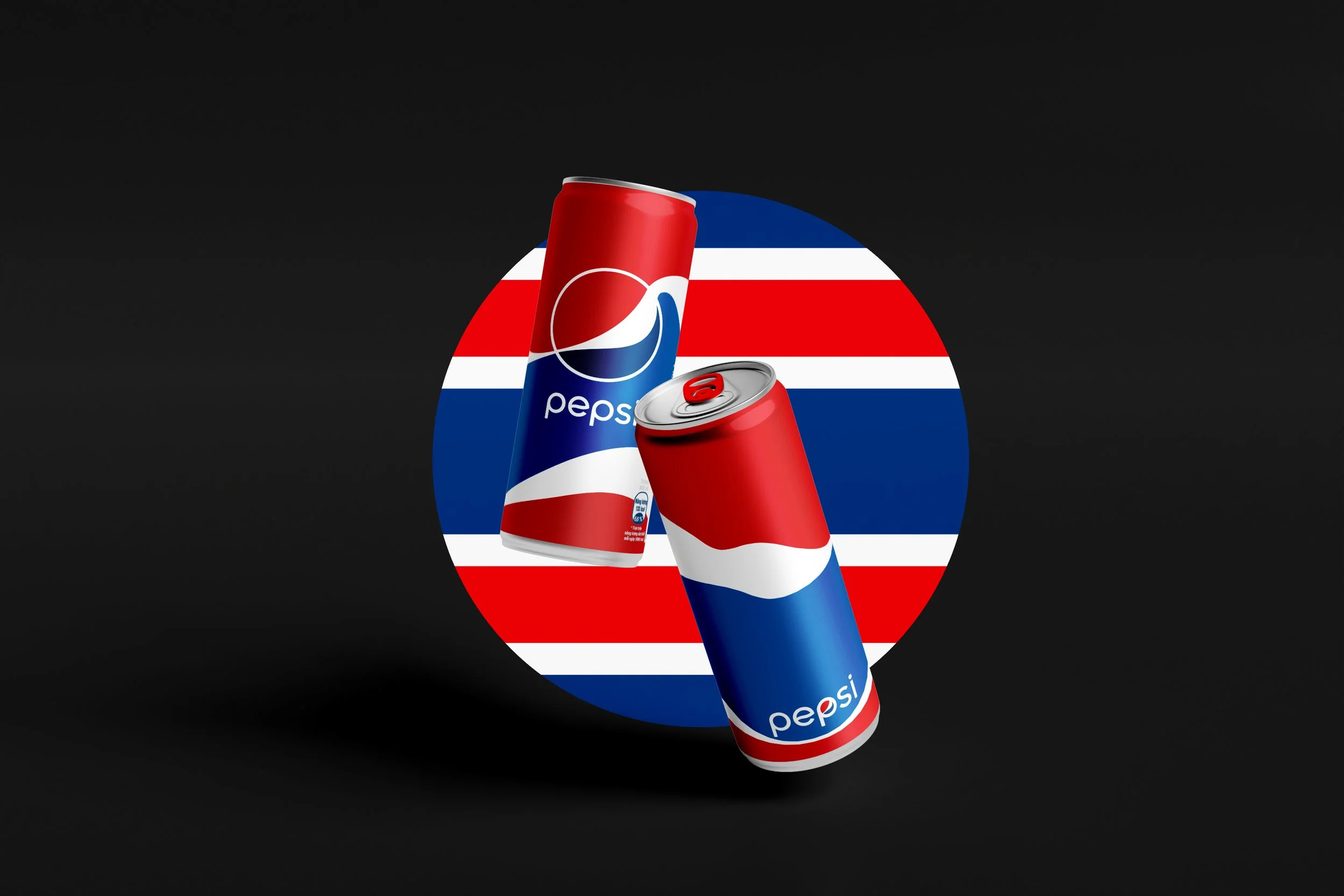

Graphic Device: Thai Flag Stripes → Modern Reinterpretation for Merchandise


Lifestyle Merch
Inspired by the Thai flag's stripes as a graphic device, this exploration reimagines traditional elements through a modern lens.
This approach transforms audience perceptions, repositioning Thai flag-related design from outdated to undeniably contemporary and stylish